

First pressing, original Mouthpiece 7" cover
With the release of the Mouthpiece discography looming on the horizon for January 20th 2009 on Revelation Records, I thought it might be interesting to explain a few frequently asked questions. One topic that comes up from time to time would be the story behind our different record covers. Over the next two months, leading up to the release, I'll do my best to tell those stories and some others.
Appropriately I'll start with the story behind our first 7" cover. This would take us back to sometime around May of 1991. We recorded our first 7" for New Age Records at a studio in South Jersey called Why Me?. Why we chose to go there was simple, Turning Point had recorded their "It's Always Darkest Before The Dawn" LP there, 4 Walls Falling had recorded their "Culture Shock" LP there and Edgewise had recorded their "Silent Rage" 7" there, to name a few. At the time it just seemed like a no-brainer for us to record there. Once we did indeed record, the next step was to figure out how exactly our 7" was going to look. Now I had pretty much been the exclusive layout / design guy when it came to all the fanzines that I was apart of in the past. When we started Mouthpiece, I naturally took on the designer roll. I had always been into the aesthetic side of hardcore, so when deciding how we wanted to represent Mouthpiece I really wanted to get it right.
First pressing, Mouthpiece 7" back cover
Jason (Mouthpiece drummer) and myself were taking graphic arts classes at a vocational school when we were in high school. We also had two other friends that were taking the same class with us, both straight edge kids we hung out with, went to shows with, etc. At one point, around the time of us recording our 7", Jason and our friend Scott came up to me showing me a photo that they had ripped out of a book. The photo captured the aftermath of a bar that had been destroyed by Carry Nation.
Now if you aren't familiar with Carry Nation, I'm referring to the actual lady, not the band who did indeed get their name from the lady. Carry Nation was a woman that strongly opposed alcohol in the pre-Prohibition days. On many occasions, Nation would enter an alcohol-serving establishment and attack the bar with a hatchet. In 1865, Nation met Dr. Charles Gloyd, and they were married on November 21, 1867. Gloyd was by all accounts a severe alcoholic. They separated shortly before the birth of their daughter, Charlien, and he died less than a year later in 1869. Nation attributed her passion for fighting liquor to her failed first marriage to Gloyd.
Knowing Carry Nation's story and seeing this dark, almost creepy photo of a destoryed bar, Jason, Scott and myself all agreed that this photo had to be used on the cover of the Mouthpiece 7". It's not that we were some crazy, hard line straight edge kids that were going to be smashing up any bars ourselves, but this photo just connected with us. It almost had an abstract look to it. If you saw the photo, it definitely wouldn't be a surprise if you had no idea what it was and in a way, we kinda liked that.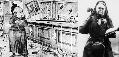
Carry Nation cartoon that depicts art similar to the scene on the cover of the Mouthpiece 7"
So there we had a start, how we were going to put it all together, I had no idea. That's when I started doing some research. I remember at the time Revelation was on the verge of releasing the Supertouch "The Earth Is Flat" LP. Rev had a Supertouch ad out that I recall thinking was super cool looking. Basically all black background, white, bold, lowercase text and a white border going around a black and white photo. I believe the photo was one that we've actually posted on DCXX in the Andy Guida interview. It's an abstract looking shot of Supertouch frontman, Mark Ryan's face up close. So I knew I really liked that design right from the start, by seeing the ad. Then when the actual Supertouch LP was released, the look of that record weighed even heavier on me. They basically carried over the same font, carried over the white border idea, threw in some color, threw in some cool looking hand written song titles and boom, they had a unique, dark, powerful looking record.
Another record that I recall inspiring me was the Mission Impossible 7" on Dan O'Mahoney's Workshed Records. Out of all honesty, I couldn't tell you what the band sounded like, but I remember liking their use of purple ink on a stark black and white record cover. Mission Impossible also used the the font Compacta, which is the same font Mouthpiece went on to use, only we used it in the lowercase version and Mission Imposible used it in all caps.
The Supertouch LP and Mission Impossible 7" that inspired the Mouthpiece 7" cover
So basically, I grabbed design ideas from the Supertouch LP and the Mission Impossible 7", mixed it all up and came out with an aesthticly dark looking straight edge 7". Now if you're looking at the Mouthpiece 7" and wondering where this Mission Impossible inspired purple ink is, you're not going to find it. Unfortuantely, when all was said and done and we opened our box of records that came straight from New Age, Mike Hartsfield at New Age decided last minute to save a little cash, skip out on the purple ink and go with a straight black and white print job. The purple ink was supposed to be used on the Mouthpiece logo on the cover, the ... straight edge on the back cover, the side one and side two hand writing (all hand writing was done by Ressurection drummer, Chris Daly) on the back cover and maybe a couple of other details that I can't recall. The only place you can see a sign of the purple that was to be on the cover, would be the matching limited purple vinyl. At the time I remember being slightly bummed, but ultimately the record still looked cool and we were just psyched out of our mind to have it released. -Tim DCXX
Tuesday, December 9, 2008
The story behind the first Mouthpiece 7" cover
Subscribe to:
Post Comments (Atom)


6 comments:
Awesome idea for a series of posts. I remember you telling me what the image was on the 7", but I don't think we ever talked about it in that sort of detail.
That Carry Nation was a real piece of ass. Smokin!
Very interesting and a damn good read too. Nice to see the Mission Impossible 7" cover after all these years as well (great record too).
didn't the first press of the Ressurection 7" that came out around the same time as the Mouthpiece 7" have a similar prohibition-type photograph on it? a bunch of smashed bottles or something?
The Ressurection 7" had a photo of broken beer bottles. It was a photo that they actually took specifically for the cover of the 7".
Being a member of Mission Impossible, it was good hear the cover of our 7" influenced the cover of your 7". Cheers.
• Spencer
Post a Comment