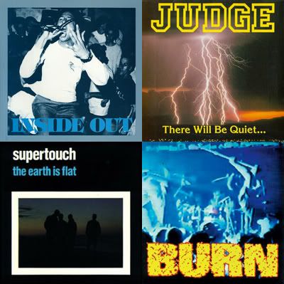
In 1990 Revelation ran a series of ads promoting a number of records that were slated to be released that year. Various ads had mocked up cover art prior to the release of the records. The majority of of these mocked covers ended up being pretty similar to what the final versions were, but there were some slight differences on a few that I always found to be interesting. Here's a handful of these alternate covers. -Tim DCXX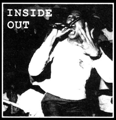
Rev: 19, Inside Out - 7"
Slightly different cropping of the cover photo here for the Inside Out 7", plus the photo is full bleed. The biggest difference in my eyes is the font choice and placement for Inside Out. Personally I think I prefer this font choice because it's more in line with the typewriter style font that Inside Out used on their shirts. 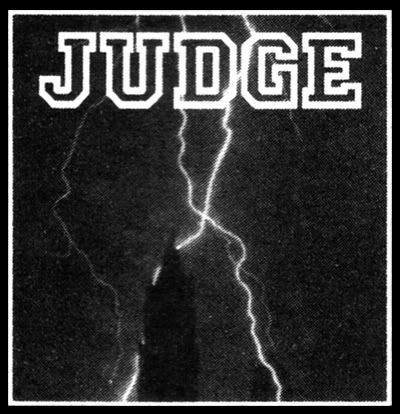
Rev: 20, Judge - "The Storm" 7"
Different lightning shot here on the Judge "The Storm" 7" cover. Looks to be a church steeple or castle, which I think ads a bit of a creepy/darker factor. Also, no title on the mock as opposed to "There Will Be Quite…" which appears of the actual press.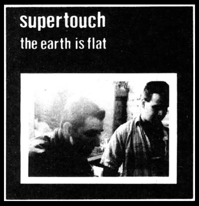
Rev: 21, Supertouch - "The Earth Is Flat" LP
I always liked this mock up cover for Supertouch's, "The Earth Is Flat". Still very similar to the actual release, but a totally different photo of Mark and Joe, which looks to be taken back stage somewhere. All these ads were black and white, but I thought this cover looked particularly cool in black and white. Like the Judge 7" above, this mocked version had a darker vibe than what appeared on the actual cover and I think I actually prefer it for this one.
Rev: 22, Burn - 7"
The differences on the cover of the Burn 7" are pretty minimal when compared to the actual release, but still there are a couple differences. The mock up has the Burn logo on top as opposed to on the bottom and I definitely think the logo placement made a significant improvement. Those heads in the crowd down there kinda ruin the photo, so covering them up with a Burn logo really turned your attention away from them. The photo cropping was slightly different from this to the release, again making an improvement. I don't know how many bands could use a video screen grab for their record cover and make it look cool, but Rev/Burn definitely made it work for this.
Thursday, July 14, 2011
1990 Revelation Records mock record covers
Subscribe to:
Post Comments (Atom)



12 comments:
Such a brilliant idea for a post—well played DCXX!!!
Definitely agree, would love to see more posts on records graphic design.
good job.
I need to thank Larry Ransom for scanning and sending me the 1990 Rev ad that appeared in Thrasher and had all of these images on it. Originally I considered just posting the entire ad, as I did with the SOIA ad the other day, but I thought it might be more interesting to point out these alternate cover images instead. So thanks again to Larry and if anyone has any old Rev ads, feel free to send them in, I'd love to get more up. -Tim DCXX
Thrasher it is! You're actually saying that we collectors not only have to look at the records themselves, or asking the hardcore labels, or the DIY HC zines BUT also TRASHER to reconstruct the history of a record coming into being! Anyway, can I ask you to do a post about trasher magazine? I really don't know that much about it! Was it also a bigger zine back in the late 80's / early 90's? It still exists right?
Thrasher Magazine..... Skate or Die!
Yeah I know it's a skate magazine
"Does TRASHER still exist?" Flanders you sound like a moron.
The story behind the Inside Out cover is kinda funny. I know that someone wrote about the history of the photo a while back and the reason it's cropped so tight is because I wrote on the original. I was standing in the corner of the photo in a gigantic sweatshirt and I wrote "Mikey" on myself. Who fucking knows why I did that.
FYI - Thrasher has most/all of it's back issues on line for your viewing pleasure. Just google 'em.
the inside out photo is cropped tight because i was sitting in the bottom left hand corner waiting for dave sine, mandel or whoever took the picture, i can't remember, to stick my tongue through my fingers. i waited to long and missed it. fucker.
-gb
awesome post. i always wanted to do something like this in my old 'zine but was lazy and never got around to it, so its cool to see a proper treatment given on Double Cross.
i totally remember that 1990 ad and the "original" cover for the IO 7".. which i also liked much better (at least in concept) than the actual released one just because that typewriter font matched those IO shirts they had from the era. i guess the real layout they ended up going with was a lot more cohesive overall in terms of theme/color etc, but it also had a bit of krishna vibe to it as well which i never thought represented the band 100%... but whatever, that's just me.
for some reason i thought there might be another mockup version of the Judge cover out there, that was the same mockup pic only in color but i might also just be imagining it at this point, haha.
@GB - btw the Inside Out cover photo wasn't taken by dave sine, you can see him in the background of the pic!
Post a Comment