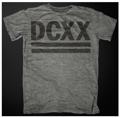
Brand new Livewire / Double Cross collaboration shirt
It's summertime 2011 and what better time to drop a brand new Double Cross shirt? This design has been brewing for a while now and just finally came to fruition. Double Cross silent-partner and head honcho over at Livewire Records, Ed McKirdy, put this simple yet powerful design together all himself.
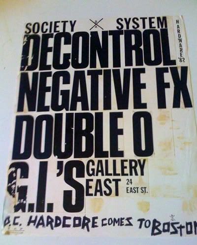
Totally inspired by the early 80's, Dischord / X-Claim era, this shirt looks like something you could have picked up at a 1983 Boston, Gallery East, SSD show or a Minor Threat show at the Wilson Center in DC. Shirt quality and print style are all intentionally combined for a vintage look and feel.
This first batch of shirts is limited to a run of 36. The plan is to see how this batch does and from there we'll decide on a second run and alternate color combo. If you like what you see and want to grab one of these, follow the link for more information and get your order in before they are all gone. Thanks for the support. -Tim DCXX
Livewire Double Cross Webstore
This particular Gallery East flyer was a huge inspiration to the design of these new DCXX shirts
Wednesday, July 20, 2011
Livewire / Double Cross shirt collaboration
Subscribe to:
Post Comments (Atom)


19 comments:
No XXL man oh well guess I'll squeeze in an XL
Fucking awesome shirt that I'll be ordering right now!!!
ORDERED 2 just because.
Thank you for not printing this on those P.O.S. Gildan shirts. I hate those f'n shirts.
The PayPal page keeps freezing (with both FFox and Safari) is it already sold out ? or limited to the US ?
Cheers.
Karim.
KMB- It looks like only Mediums are left. I'll double check with Ed and post back here later this morning to confirm. -Tim DCXX
Tim > Which is exactly the size I'm looking for, but still no improvement on the PayPal link... :(
K.
Dope shirts. Ordered. Nice work.
Guess it's time to print more...
very cool, it's an instant classic, great job
next shirt, how about the classic harDCore graphic
Font is all wrong.
Although that Gallery East flyer was an inspiration, we had no intentions of using that same font for this shirt. The X's look semi-ridiculous in Compacta (which is the font used on that flyer). I think Ed was going for more of a Flex Your Head look. -Tim DCXX
Tim is right—the aggressive typography of the Gallery East flyer was merely an inspiration not a blueprint. I did zero font matching and simply went with what felt right and looked the best to me.
I really hate this era of "limited" records and shirts. My size XL is sold out in 1 day, great.
Don't know how many people follow DC, but 36 shirts seems like not too many.
damn flippers
Don't worry, if you missed out on the first batch, the second run order is being placed today. -Tim DCXX
Yawn......
Awww... Anonymous got all yawny and sleepy. Should I get you a little blanket and some cozy PJs?
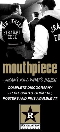
"This design has been brewing for a while now..." How much work did it take to come up with a design that is exactly the same as the sleeve on the Mouthpiece shirt I bought in the early 90s (which was a Flex Your Head ripoff anyway).....take away one "X" and replace it with "DC"? Methinks there's a skip on this record.
Post a Comment