


The design of the early Revelation Records releases could summarize the aesthetic of that era in hardcore possibly better than anything else from the time. Every one of us has at some point pulled out their copy of Bringin' It Down or Start Today and studied the lyrics, read the thanks list, and stared at the photos. If you haven't...well then you might as well stop reading, because this interview won't interest you. But if you love this stuff like us, then you may have noticed that the design on a few of these gems is credited to a faceless guy named "Dave Bett." I was always curious who he was. Was he just some hardcore kid with skills? Was he a professional graphic designer who was simply hired by Revelation?
Personally, I had never gotten a ton of solid answers about him beyond the basics, so being able to track him down and get the scoop was all news to me. To be honest, I figured this was a "normal" design guy who threw together some sick layouts, got paid, and forgot about it. To read his answers below, I was psyched to hear what he remembered, and reminded again just how fucking powerful hardcore can be. -Gordo / TM
Prior to designing some of the early Revelation releases, what was your involvement/connection in the hardcore scene?
I had no involvement. I barely knew it existed. I'd just turned 30 and was married with a new baby. My lifestyle, aesthetics and musical taste were pretty different from what I came to see in people I met later in the hardcore scene. I was working at Relativity/Combat Records, the label for Important, a distributor of a lot of the indie labels at the time. I'd just been hired as their in house art director in 1987, designing albums for indie college bands, guitar gods and all kinds of metal bands. We were in a warehouse off the tarmac of JFK in Queens. I'd quit a decent paying job in advertising, which I hated, and taken a leap of faith to work with something I really loved – music. I can't say I loved all the music (and album art) Relativity put out. But it was a great scene of characters and an inspiring contrast to the life I knew up til then, and often enough there would be a creative experience that blew me away. Agnostic Front was one of the bands on Combat and I'd worked with Roger Miret on "Liberty and Justice For…" so I did have a taste of what was to come.
How did you get linked up with doing design and layouts for Revelation?
Revelation was one of the labels distributed by Important. One day, Jordan Cooper came in and I was asked to help him put together some of his upcoming album packages. He's one of the people who stands out in my memory of that time. At that first meeting he seemed like a quiet and unassuming kid from Connecticut, young but with this great drive and integrity, and he knew exactly what he wanted. I liked him and was impressed with the in-your-face kind of music he was putting out. I thought punk was punk, but got a quick and thorough education in hardcore.
What was the first thing you recall working on for Revelation?
It was a brief period, maybe just a year or two (late '87 to early '89?), and it all seemed to happen at once. Could've been Bold "Speak Out" or the New York City Hardcore compilation "The Way It Is."
Of the following Revelation Releases, what can you recall as being your involvement in their design?
REV 7 - NYC Hardcore The Way It Is LP (1988) Jordan gave me the photos to use and a basic description of how he wanted it organized. I remember resisting his approach as too straightforward and kind of boring, but he persisted. Later, he'd kid me about it, because I came around to his point of view once I got to know the music better. It's straightforward, no holds barred. Totally appropriate. I loved the photos, they had tremendous energy, really put you there in the crowd. The bands all did their own artwork for the insert.
REV 8 - Youth Of Today Break Down The Walls LP (1988) My memory of it was that it was basically done when I got it. I just kind of reassembled it, keeping to that same formula of big bold type and live show photo. I met Ray Cappo and was really struck by this guy with a very pure essential energy about him, able to put out a really aggressive fearless assault, completely positive. I'd never met anyone like him.
REV 9 - BOLD Speak Out LP (1988) Again, Jordan gave me the photos and direction on how to put it together. I've always liked this cover, for the colors, the type, the simple symmetry of the layout. And I still have a great Bold t-shirt that my son wears now.
REV 12 - Gorilla Biscuits Start Today LP (1989) This was the one I enjoyed doing most, because it has a sense of humor. The evolutionary ape-to-man art, the multi-colored type, the caveman character on the back, with an amazing shot of the guys leaping on stage. This time the band, rather than Jordan, collaborated with me on the art. I vaguely remember Wally coming to my apartment in Brooklyn to go over the layout, being really quiet so we wouldn't wake the baby. But this might be a dream. Anyway, it all came together well and I still have people who come up to me asking if I'm the same guy who did the GB cover. Then I had no idea how influential their music and that album in particular would become.
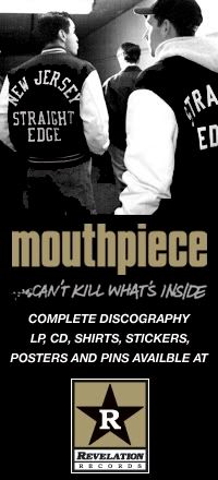
REV 15 - JUDGE Bringin' It Down LP (1989) I'm pretty sure this was the last thing I designed for Revelation. Same process, got the stack of photos & logo and kept to the style we'd established for the Revelation covers, the style Jordan wanted from our very first meeting.
What type of arrangement was there between you and Jordan Cooper/Ray Cappo as far as your services?
I never really knew if you were a friend who offered to help out and provide professional talent, or someone actually hired to come in and do everything?
I think Jordan was coming to Important for help in packaging his releases and I was their guy. Of course, if I hadn't been successful in giving Jordan what he needed he would've found someone else to do it, but we hit it off fine. He gave me a good schooling. I saw the hardcore scene as an education. Coming from a pretty uptight conservative family I was always happy to find experiences that pushed beyond those values. I'd go to the CB's matinees and get into the crowd, meet the people. BJ Papas, who photographed a lot of the bands, became a good friend. Steve Martin, who played for Agnostic Front, and Arman Majidi, who played with Sick of It All, both worked with me at Relativity. They were fearless, funny, no bullshit people.
Similarly, when you were hired for a release, were you just sent a package of photos and materials and told "go for it," or do you remember actually sitting down with the band/label and laying things out piece by piece?
Gorilla Biscuits was the only band I really worked with one-on-one. Jordan mostly acted as spokesman for his other bands. He was specific about style, then let me do to work. I don't recall there being many, if any, changes or back and forth. We all seemed to be on the same wavelength.
Two milestone releases for Revelation (to me, design wise) are the Judge Bringin' It Down LP and The Gorilla Biscuits Start Today LP, and both are the Rev releases that are most associated with your design. The color selections, overall layout, vinyl color incorporation, photos, and even the embossed cover on the GB LP really capture those bands at those times to a T and look very distinct. What do you recall about those releases, and do you have any memories of what influenced those designs?
Well, that's nice to hear. Thanks. I guess those two album packages were where we hit on what you could loosely call a trademark Revelation look. Not that we were breaking any new ground. It's a stretch, but the Judge record felt like our version of the cover of the Clash's "London Calling," which was an even more exact copy of an Elvis cover. Just taking a great guitar image with all the energy that goes into a live performance, running big type in good colors down the side. We identified with fat serif bold typefaces because they had a strength and solidity that made sense with the music. It was cool that Jordan spent the extra money for us to emboss the GB type. That was a nice touch.
Compared to the other work you were doing at the time, was the Rev stuff very small potatoes, or actual legit projects you took very seriously?
Relativity had an amazing guitar player, Joe Satriani, who was breaking at the time, going platinum. He was our main focus, along with metal bands like Death. We also had a lot of UK stuff, since Important started as an importer. Our other big seller, believe it or not, was the UK recording of "Les Miserables," which basically paid for everyone's salary then and allowed us to move to a bigger building. So, in that context, Revelation wasn't expected to be a big money maker. But musically and personally, it was huge for me. It was making a statement, not just entertainment. It was a way of life, a philosophy, a set of ideals. It felt true and significant. A whole culture to itself. And I admired the people who lived in that culture.
At one point did you stop doing design for Rev, and why?
I think Jordan's business relationship with Important changed. He was working out of Connecticut and by that time knew how to get the design he wanted, found other people to do it. I didn't hear from him for a long time, but then he asked me if I'd work on the reissue of Start Today. I really wanted to, but I was already committed to other projects. Too bad.
Aside from actual record layouts, what else did you design for Rev, or even other bands? Didn't you have something to do with fine tuning the actual Revelation Records star logo?
Sick of It All was one of the bands on Relativity. I worked with Patricia Lie on the "Blood, Sweat and No Tears" album, which has also had a nice legacy to it. Arman worked in the office doing publicity, and Lou and Pete Koller lived in Queens so they came in all the time. They had a pretty strong presence around the place and there was a period where I felt SOIA was the most important thing I was working on. I also did some Circle Jerks work. If I remember correctly, Jordan gave me a pretty rough version of the Revelation logo and asked me to make a workable final version. So I set the type and cleaned it up.
After Revelation, what connection did you keep to the hardcore scene, and where did you go from there? What do you do today?
That time definitely altered my musical taste. Appropriately, as I say this, Black Flag "Nothing Left Inside" just started playing on LastFM on my computer. And a lot of what I listen to in current music has hardcore punk influences. In the late 80s I actually got very into Black Flag classics, and then Rollins Band. I also loved Henry's spoken word performances. He was a fix of total honesty. We named my second child Henry, not after Rollins, but just because he made Henry a cool name to have. Rollins once signed an autograph at a show which he wrote to my son: "Henry, Grow Tall." A true hardcore sentiment. In the 90s I did a lot of work for rap artists – Eazy E and a host of LA gangsta rappers, Common, Fat Joe, Wu Tang Clan. That was the underground music of that time, another kind of hardcore scene and another education for me. I visited some of the worst ghettos in this country, trying to tell the artists' stories. One of my friends from that scene ended up doing time for a gang murder, but he was such a good soul, trying to break away from the gang life. I've found that kind of contradiction pretty often in creative people. Brilliant but crazy. Funny but tragic. Good hearted but wild. About 6 years ago I started working for Sony BMG and have designed for some huge artists in the mainstream, a far cry from where I started – Springsteen, Aerosmith, John Legend. I got a Grammy nomination for a Tori Amos package I did with Sheri Lee. For the past couple years I've been the design director for Columbia Records. Recently I designed Patti Smith's "Twelve" album, a highlight in my working life. To me, she fits all the definitions of hardcore -- heartfelt, intense, political, positive, independent, uncompromising, true to herself and her art. So it may be 20 years since my Revelation days, but it stays with me still.


7 comments:
I'd love to know if he had/has any alternate layouts that didn't get done.
I still love the bold record layout i poured over that thing for hours.
A classic.
While I enjoyed the interview (interesting choice), I can't say I agree that any of the Revelation layouts are awe inspiring. I'd like to think the limitations of digital graphic design programs in the early 1990's had something to do with it. Pretty sterile if you asked me...Dave K.
How incredible is this guys journey. From HC to rap and then on to a grammy nod. Very cool
I think Dave had a great clean look for the time. I would also disagree about limitations because of the lack of digital design. Pre computer graphic designers were the real deal. It was 100x's harder to be a designer before the computer and it took real skill, type knowledge and hard work. The best design of our times came out before any computer aided design.
We're just borrowing from what was done over the past 50 years.
Great blog guys. Keep it up!
Another great and unexpected interview! And I can't agree more about the early REV stuff design wise. Gettig TWII and Speak Out blew my 15 year old mind. I still love getting them out and studying the artwork.
Psyched to see what you guys do next. I hope more people get pried out of the woodwork.
I started design school in 1990 and the principles of graphic design don't exacly change.In Fact everything was taught by hand even how to do freehand alphabets.the modern software has not only made professionals jobs easier but it also allowed any jerk off with a kinkos card and pagemaker to call themselves a graphic designer case in point that glut of zines in the mid to late 90s with the same layouts,fonts and burnt edge photo borders.
HARDWARE is the exception though!
Great interview, I can't believe I missed that, thanks guys for choosing this topic as a rerun.
I'm currently starting doing artworks for bands and it's really inspiring to hear from the veterans!
If anyone's interested in having some artworks don't hesitate checking my in-progress portfolio I'd love to help out.
Cheers.
K.
http://kmb.viewbook.com/
Post a Comment